Bedding · Design Notes
How Herringbone Embroidery Shapes the Look of a Sateen Duvet Cover
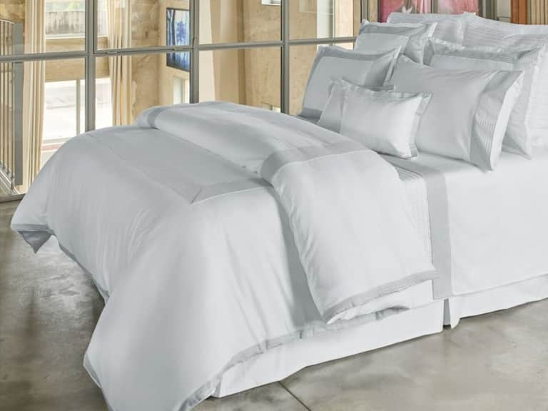
A bed can be dressed with restraint and still make an impression. In the BOVI Herron duvet cover, the polished surface of cotton sateen meets a pronounced herringbone embroidered detail—a pairing that brings together softness, sheen and pattern without overwhelming the room.
The appeal of a well-considered duvet cover often lies in the conversation between its materials and its finish. A smooth fabric reflects light differently from a textured one; a line of embroidery can add definition to an otherwise quiet surface. The BOVI Herron Sateen Duvet Cover makes that interplay its central design idea. Woven from 100% cotton sateen, with a 300-thread-count fabric and bold herringbone embroidery, it balances a silky hand and subtle sheen with a more graphic, tactile accent.
That balance is useful in a bedroom, where textiles occupy a generous share of the visual field. The duvet cover can act as the room’s focal point, or it can quietly connect the bed to the colors, finishes and furnishings around it. The Herron design offers a route between those extremes: refined enough to feel composed, distinct enough to give the bed character. Available in crisp white or delicate silver, it can read as bright and classic or softly tonal, depending on the palette around it.
What sateen brings to the bed
Cotton sateen is a weave, not a separate fiber. It is made from cotton yarns arranged in a way that brings more of the yarn’s surface to the face of the cloth. That construction gives sateen its characteristic smoothness and gentle luster. It is not a mirror-like shine; rather, the surface catches light with a soft, even glow that can make a bed feel polished without looking overly formal.
The effect is especially noticeable across a broad expanse of fabric. On a duvet cover, a sateen finish gives color a certain depth and lends the textile a fluid, inviting appearance. It can complement tailored furniture and clean-lined rooms, but it also works with layered interiors, where its smoothness offers a counterpoint to nubby throws, textured rugs or matte-painted walls.
Touch is part of the story, too. Sateen is often appreciated for its smooth feel against the skin, making it an appealing choice for those who prefer a sleek rather than crisp surface. Personal comfort remains subjective, and the sensation can vary with the weave, finishing and laundering. But the overall impression is clear: sateen gives a duvet cover a softer visual and tactile character than a more textured, matte fabric might.
>On the BOVI Herron, that smooth foundation matters because it lets the embroidery stand out. The fabric supplies a calm, luminous ground; the stitched pattern brings dimension and visual rhythm. Rather than competing details, they are complementary ones—the quiet polish of the cloth setting off the confident geometry of the embellishment.
The language of herringbone
Herringbone is a familiar zigzag pattern formed by short, angled lines that meet in alternating directions. Its name evokes the bones of a fish, but its visual character is more architectural than literal: a sequence of chevrons creates movement while retaining a sense of order. In textiles, herringbone may appear in the weave itself or, as with the Herron duvet cover, as embroidery applied to the fabric.
Embroidery changes how a motif is experienced. Instead of being carried solely by the structure of the cloth, the pattern is built with thread on its surface. That can make the design feel more defined, adding relief and a subtle shift in texture that becomes apparent in changing light. The BOVI Herron’s bold herringbone embroidery introduces a decorative line against its smooth cotton sateen, giving the surface a sense of depth without requiring a busy print or strong color contrast.
Pattern also gives the eye a route across the bed. A repeated angled motif lends energy, while its regularity keeps that energy measured. This distinction is important: embroidery can make bedding feel ornate, but a clean, repeating geometry helps the decoration remain composed. The result is an accent that reads as intentional and tailored, rather than fussy.
Because the pattern is stitched rather than printed, it has a dimensional quality that can make the duvet cover feel considered from up close. At a distance, the embroidery contributes structure and emphasis; nearer, the change in surface offers an additional detail to notice. That layered impression is one reason embroidery remains so effective in bedroom design: it gives an otherwise simple textile a finish that rewards both the overview and the close look.
A study in contrast, not excess
The Herron design’s strength is its contrast of sensations. Sateen is smooth; embroidery is raised. The cloth reflects light softly; stitched lines create areas of definition. One element is about ease and continuity, the other about pattern and punctuation. Together, they make the duvet cover feel dressed without relying on elaborate layering or a complicated color story.
This kind of contrast can be useful when deciding how much decoration a bedroom needs. A room with patterned wallpaper, richly grained furniture or several colorful accessories may benefit from bedding that has a clear motif but a restrained palette. In a quieter space, the same embroidered design can provide enough visual interest to keep the bed from feeling bare. The pattern does not need to dictate the rest of the room; it can simply establish a point of focus.
Texture is also a way to build atmosphere without adding more color. A room designed around neutrals can sometimes feel flat when every surface has the same finish. The interplay of smooth sateen and dimensional embroidery adds variety while preserving a cohesive palette. Layering a knitted throw or a matte linen cushion can extend that tactile mix, though the duvet cover is distinctive enough to stand on its own.
For a more tailored look, keep surrounding layers simple and let the embroidered detail lead. For a softer, more collected mood, combine the duvet cover with relaxed fabrics and natural tones. Either approach allows the herringbone to remain legible while giving the bedroom a personality that feels personal rather than prescribed.
Choosing between white and silver
Color influences whether embroidery feels graphic, subtle or somewhere in between. Crisp white is the most classic option, with a fresh, bright presence that suits a range of bedroom styles. It can echo pale walls and light-colored furniture for a serene, tonal scheme, or stand out against deeper paint, dark wood and richly colored accents. White also emphasizes the clean lines of the herringbone motif, allowing the pattern to feel especially crisp.
Delicate silver offers a gentler interpretation. Its cool, light tone can introduce a quiet shimmer and a little more nuance than a pure white palette. In a room with gray, stone or muted blue accents, silver can create a subtle connection between the bed and the surrounding colors. It can also soften the contrast of the embroidery, giving the design a more understated presence.
Neither shade should be considered in isolation. Natural and artificial lighting can change how a pale textile reads: a cool daylight may bring out silver’s cooler character, while warm lamps can make white feel softer. Wall color and nearby finishes matter as well. Before settling on a palette, consider the room at different times of day and think about whether the duvet cover should blend into the scheme or act as its brightest note.
- For a crisp, classic bed: choose white and keep the surrounding palette light, or use darker accents for definition.
- For a softly tonal room: consider silver alongside gray, ivory, pale blue or stone-colored layers.
- For a more dramatic setting: use either pale color against deeper surroundings, allowing the duvet cover to become a clear focal point.
How to style the Herron duvet cover
Start with the room’s existing visual vocabulary. If the bedroom already contains strong patterns, choose sheets and accessories that support rather than compete with the herringbone. Solid colors are an easy foundation. They let the embroidery remain the principal motif and help the overall bed feel deliberate. A limited palette—perhaps two neutrals with one accent color—can make the arrangement look composed without feeling overly coordinated.
For a calm, light-filled look, pair white sateen with pale sheets and a subtle textured throw. Vary the surfaces rather than introducing several prints: a quilted coverlet or a woven cushion can add depth while respecting the duvet’s pattern. To create a sharper, more contemporary mood, bring in charcoal, ink or deep green through smaller accents. The contrast frames the pale bedding and makes its embroidery more noticeable.
Silver lends itself to tonal layering. Combine it with soft gray, warm ivory or muted blue, then add a contrasting texture—matte cotton, knit or a naturally irregular weave—to keep the arrangement from appearing too uniform. If the room is already full of reflective finishes, balance the sateen’s subtle sheen with matte accessories and understated bedside surfaces.
Proportion matters as much as color. A duvet cover spreads across a wide area, so a strong embroidered detail can have a considerable presence even when its palette is restrained. Let the bed breathe: avoid crowding the top with too many decorative pillows, and make sure any additional patterns vary in scale or character. A simple arrangement can show off the design more effectively than a heavily layered one.
The practical side of the fabric
Good design has to work in daily life. A duvet cover protects the insert and is handled more often than many decorative textiles, so ease of use and care deserve a place in the decision. The BOVI Herron is described as 100% cotton sateen, with a 300-thread-count construction, and is available in Twin, Queen and King sizes. Its refined finish gives it a polished appearance, while the cotton composition offers the familiar appeal of a natural fiber.
Care routines should always follow the product’s current label and manufacturer guidance. For embroidered bedding, sensible habits include avoiding harsh treatment and taking care not to snag the stitched detail during washing or handling. Using an appropriate cycle and keeping fasteners or rough items from rubbing against the fabric can help preserve the surface. If the cover is washed frequently, rotating it with another set can reduce wear and give each textile time between uses.
Wrinkles and the character of a lived-in bed are part of the visual conversation, too. Sateen’s smooth surface can look especially polished when freshly made, while the embroidered pattern lends enough detail to remain interesting when the bed is less formal. The aim need not be perfect, hotel-like presentation every morning. A duvet cover should support a bedroom that feels inviting and functional, not merely arranged for display.
When comparing duvet cover fabrics, consider the full experience rather than relying on a single specification. Thread count alone does not describe every aspect of quality or comfort. Fiber, weave, finishing, construction and personal preference all contribute to how a textile feels and performs. For the Herron design, the defining combination is its smooth cotton sateen and embroidered herringbone—not a number in isolation.
A considered alternative to plain bedding
Plain bedding has enduring appeal, but it is not the only route to a restful room. Embroidery can make a simple color feel more expressive while avoiding the all-over busyness of a printed design. The Herron duvet cover uses a recognizable geometric pattern to introduce character, then tempers it with the softness and restrained sheen of sateen. Its design is decorative, but its palette remains easy to work into a considered interior.
That makes it adaptable across different moods. In a bright, minimal bedroom, the embroidery can supply a focal point without disrupting the clean lines. In a more layered interior, it can become one texture among many, adding definition to the bed. And in a room that changes with the seasons, white or silver can serve as a light foundation for warmer throws and deeper accent colors in cooler months.
The key is to think of the duvet cover not as a finishing touch added at the end, but as one of the room’s principal design decisions. Its scale, color and surface affect the atmosphere immediately. A smooth sateen fabric gives the bed a composed finish; herringbone embroidery lends it structure; the choice between white and silver determines whether that structure feels crisp or softly nuanced.
A refined focal point with everyday appeal
The BOVI Herron Sateen Duvet Cover brings together elements that are often compelling precisely because they are different. Cotton sateen offers a smooth, luminous ground. Herringbone embroidery adds graphic order and tactile definition. White and silver provide two distinct moods, each restrained enough to invite personal styling.
For anyone choosing a duvet cover, the lesson is broader than a single design: look beyond color and ask how weave, texture and detailing work together. A subtle sheen can soften a room; embroidery can add dimension; a measured pattern can create interest without taking over. When those choices are in balance, the bed becomes more than a practical centerpiece. It becomes a quietly expressive part of the room.
Explore the BOVI Herron Sateen Duvet Cover to learn more about its cotton sateen, herringbone embroidery, available colors and sizes.